
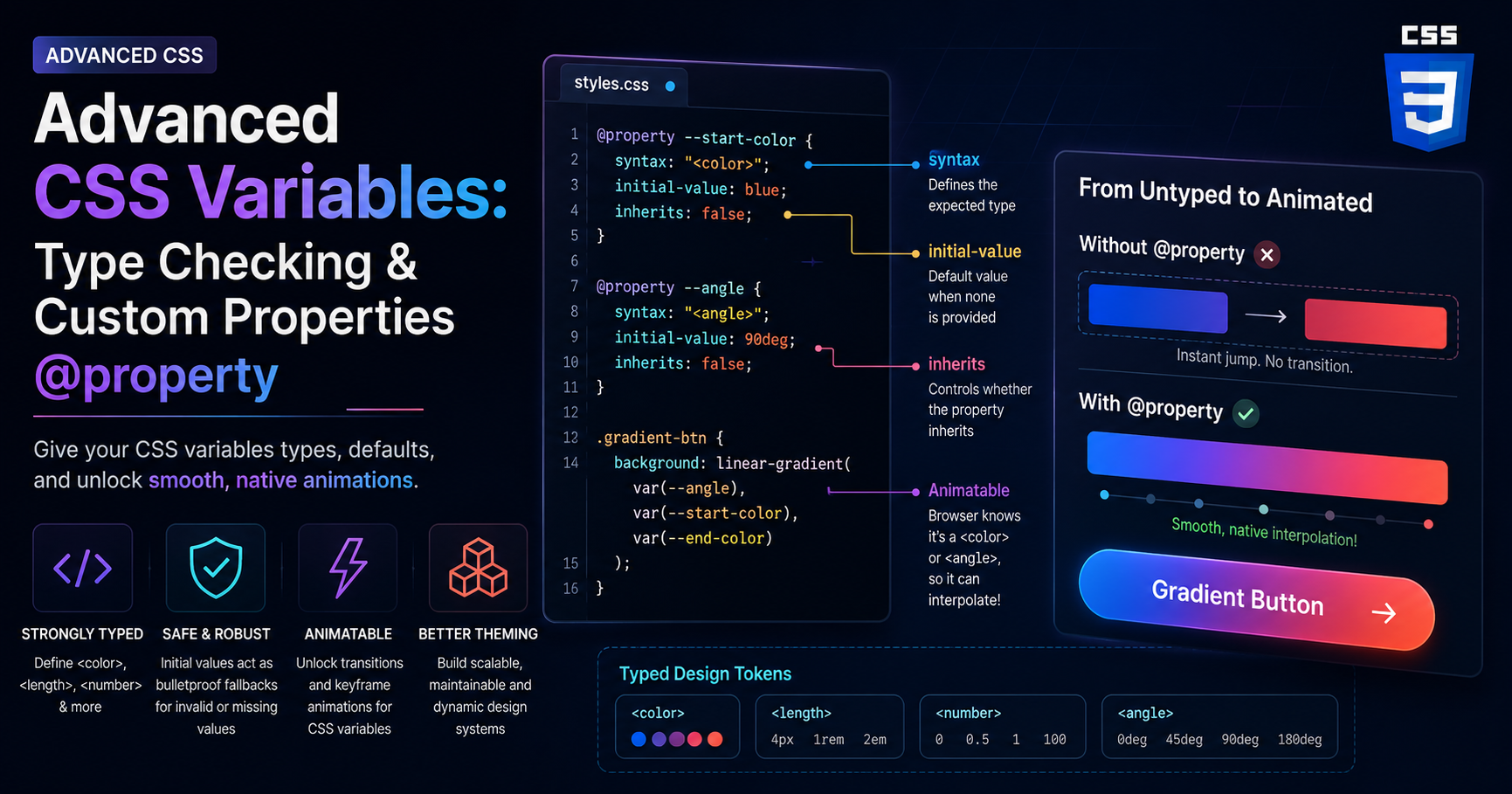
Advanced CSS Variables: Type Checking and Custom Properties (@property)
The Evolution of CSS Custom Properties
CSS Custom Properties, commonly known as CSS variables, revolutionized frontend development. They allowed us to define a value once—like a primary brand color or a standard spacing unit—and reuse it throughout our stylesheets. This dynamic capability enabled dark mode toggles, highly themable design systems, and responsive typography that adjusts seamlessly across breakpoints without complex media query overrides.
However, traditional CSS variables have a significant limitation: the browser doesn’t know what they are. To the CSS engine, a custom property like --brand-color: #ff0044; is just a string of characters. The browser has no idea that it is supposed to be a color, a length, or a number. Because it lacks this semantic context, the browser cannot interpolate the value. This means you cannot natively animate or transition a custom property.
This limitation forced developers to rely on JavaScript or complex workarounds to animate dynamic styles. But the web platform has evolved. With the introduction of the CSS Properties and Values API Level 1—specifically the @property rule—we can now give our CSS variables superpowers. We can explicitly define their types, set default values, and unlock the ability to animate them directly in CSS. This deep dive will explore how @property bridges the gap between static strings and strongly-typed, animatable design tokens.
The Problem with Untyped Variables
To understand the power of @property, we must first look at why standard custom properties fail in certain scenarios. Consider a common requirement: animating a gradient. Gradients are heavily used in modern web design for backgrounds, text clipping, and hover effects.
Let’s say we want to transition the starting color of a linear gradient when a user hovers over a button. We might try to write it like this using standard CSS variables:
.gradient-btn {
  --start-color: blue;
  --end-color: purple;
  background: linear-gradient(90deg, var(--start-color), var(--end-color));
  transition: --start-color 0.5s ease;
}

.gradient-btn:hover {
  --start-color: red;
}
If you run this code, you will notice that the background does not smoothly transition from blue to red. Instead, it snaps instantly upon hover. Why? Because the browser parses --start-color as an arbitrary string. It doesn’t know that “blue” and “red” are colors that exist on a spectrum. Since it doesn’t know they are colors, it cannot calculate the intermediate values required to create a smooth 0.5-second animation. It simply jumps from state A to state B.
This lack of type information also leads to brittle code. If you accidentally define --spacing: 10; instead of --spacing: 10px;, the browser will silently fail when it tries to use that variable in a margin property. It won’t throw an error; it will just ignore the rule, leaving you to hunt down the bug in DevTools.
Introducing @property: Strongly Typed CSS
The @property rule solves these issues by allowing developers to register a custom property directly within the stylesheet, providing the browser with its semantic meaning. It acts as a schema definition for your variables.
When you register a property, you define three critical attributes: the syntax (the expected type), the initial value (the default), and whether the property inherits from its parent element.
Here is how you define a strongly typed color variable using @property:
@property --start-color {
  syntax: "<color>";
  initial-value: blue;
  inherits: false;
}
Let’s break down these descriptors.
1. syntax: This is the most powerful part. It tells the browser exactly what kind of data the variable holds. You can specify types like <color>, <length>, <percentage>, <number>, or even <angle>. Because the browser now knows --start-color is a color, it instantly unlocks the mathematical ability to interpolate between values, making animations possible.
2. initial-value: This acts as a bulletproof fallback. With standard variables, if a variable is undefined, it falls back to the browser default (often invalidating the property). With @property, if the variable is missing or assigned an invalid value (like setting a color to “10px”), it safely falls back to the initial-value, preventing UI breakage.
3. inherits: This boolean controls whether child elements inherit the value of this property from their parents. By setting it to false, you prevent accidental scope bleed in complex component architectures, ensuring that the variable only affects the specific element it is applied to.
Unlocking Impossible Animations
Now that we have registered --start-color as a valid <color> type, let’s revisit our gradient button example. With the @property definition in place, the exact same CSS we wrote earlier will now magically work.
@property --start-color {
  syntax: "<color>";
  initial-value: blue;
  inherits: false;
}

@property --end-color {
  syntax: "<color>";
  initial-value: purple;
  inherits: false;
}

.gradient-btn {
  background: linear-gradient(90deg, var(--start-color), var(--end-color));
  transition: --start-color 0.5s ease, --end-color 0.5s ease;
  padding: 1rem 2rem;
  border-radius: 8px;
  color: white;
  border: none;
  cursor: pointer;
}

.gradient-btn:hover {
  --start-color: red;
  --end-color: orange;
}
Because the browser now understands that these variables represent colors, the transition engine can calculate the hexadecimal steps between blue and red, and between purple and orange, rendering a buttery-smooth gradient transition natively in CSS. No JavaScript required, no complex overlay hacks.
This unlocks incredibly complex effects. You can animate the <angle> of a conic gradient to create loading spinners. You can animate a <percentage> to fill up a progress bar. You can animate a <length> variable that drives a calc() function, affecting multiple elements simultaneously in a synchronized choreography.
Advanced Usage: Complex Syntax and Enums
The syntax descriptor is surprisingly robust. Beyond basic types, you can define acceptable ranges and even create custom enumerations (enums). This allows you to build incredibly strict design systems where variables can only hold pre-approved values.
For example, if you want a variable that only accepts specific keywords for a component size, you can separate the literal strings with a pipe (|) character:
@property --btn-size {
  syntax: "small | medium | large";
  initial-value: medium;
  inherits: false;
}
If another developer attempts to set --btn-size: huge;, the browser will reject it as a type error and fall back to the initial value of medium. This strict type checking brings a level of robustness to CSS that was previously only available in preprocessors like Sass or JavaScript-in-CSS libraries.
You can also use the multiplier characters + (one or more) and # (one or more separated by commas). For instance, if you are building a custom box-shadow system, you might want a variable that accepts a list of colors:
@property --shadow-colors {
  syntax: "<color>#";
  initial-value: rgba(0,0,0,0.1), rgba(0,0,0,0.2);
  inherits: true;
}
For developers exploring modern layout architectures, check out our guide on Modern CSS Architecture with Cascade Layers, or discover how to build robust grid structures with CSS Grid and Subgrid.
For a deeper technical reference, please consult the MDN specification for @property.
Conclusion
The @property rule marks a significant maturation of the CSS language. By introducing type checking, default values, and interpolation hints, it transforms custom properties from dumb string replacements into intelligent, programmable design tokens.
This shift not only prevents fragile code and silent failures but also unlocks entirely new categories of native animations and interactions that previously required heavy JavaScript libraries. As browser support reaches ubiquity, strongly-typed CSS variables will become the foundational building blocks of robust, performant, and highly interactive design systems. Embracing @property is no longer just a neat trick; it is the modern standard for writing maintainable CSS architectures.
editor's pick
latest video

news via inbox
Nulla turp dis cursus. Integer liberos euismod pretium faucibua