
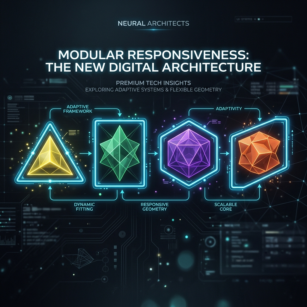
The Magic of Modern CSS Container Queries
Introduction
For over a decade, responsive web design has relied on a single, fundamental tool: the Media Query. By checking the width of the viewport (the browser window), we could adjust our CSS to reflow layouts for mobile phones, tablets, and desktop monitors.
But media queries have a glaring conceptual flaw. They force components to respond to the overall screen size, rather than the space they actually occupy. If you build a reusable “Product Card” component, it shouldn’t care if the screen is 1200px wide. It should only care if it has enough space inside its parent grid column to display its image side-by-side with its text, or if it needs to stack them vertically.
This is where CSS Container Queries come in. They represent the biggest shift in responsive design since Media Queries were introduced in 2010. In this article, I am going to explain how container queries work, why they enable true component-driven design, and how you can start using them in production today.
Core Concepts: Viewport vs. Container
To understand the problem, imagine a standard Card component. On a desktop monitor, you might display a grid of three cards. A media query checks the viewport (e.g., @media (min-width: 1024px)) and says, “The screen is wide enough, display the cards in a row.”
But what if you take that exact same Card component and place it inside a narrow sidebar on that same desktop screen? The viewport is still 1024px wide, so the media query triggers the “wide” layout. But the sidebar is only 300px wide! The card bursts out of its container or looks horribly squished. You are forced to write contextual overrides like .sidebar .card { ... }, breaking the encapsulation of your component.
Container Queries solve this. Instead of asking the browser, “How wide is the screen?”, a component asks, “How wide is my immediate parent container?”
Defining a Container
To use a container query, you first have to define an element as a “container.” You do this using the container-type property.
/* 1. Define the parent element as a container */
.card-wrapper {
  container-type: inline-size;
  container-name: card-container; /* Optional, but highly recommended */
}
Setting container-type: inline-size tells the browser to track the width (inline size) of this specific element. (You can also use size to track both width and height, but inline-size is used for 95% of layout use cases).
Writing the Container Query
Once you have a defined container, you can write a `@container` rule for the child elements inside it. The syntax is nearly identical to a standard media query.
/* 2. Style the child component by default (Mobile-first / narrow-first) */
.card {
  display: flex;
  flex-direction: column;
  background: #fff;
  border-radius: 8px;
}

/* 3. Apply changes when the container is wide enough */
@container card-container (min-width: 400px) {
  .card {
    flex-direction: row;
    align-items: center;
  }

  .card-image {
    width: 150px;
    height: 150px;
  }
}
Notice how we use @container card-container? By giving our container a name, we explicitly tell the browser which parent we are tracking. If you omit the name and just write @container (min-width: 400px), the browser will look up the DOM tree and track the nearest ancestor that has a container-type defined.
Container Query Units (CQW, CQH)
Media queries gave us viewport units like `vw` (viewport width) and `vh` (viewport height). Container queries introduce a new set of relative units based on the size of the container itself:
- cqw: 1% of the container’s width (inline-size).
- cqh: 1% of the container’s height (block-size).
- cqi: 1% of the container’s inline-size (logical equivalent to cqw).
- cqb: 1% of the container’s block-size (logical equivalent to cqh).
- cqmin / cqmax: The smaller or larger value of cqi and cqb.
These units are incredibly powerful for typography. You can scale font sizes dynamically based on the space the component actually has, rather than the size of the user’s monitor.
@container (min-width: 300px) {
  .card-title {
    /* Fluid typography based on container width! */
    font-size: clamp(1.2rem, 5cqw, 2rem);
  }
}
Common Mistakes / Pitfalls
1. Trying to query the element itself
You cannot put container-type on an element and then immediately use a @container query to style that exact same element. This creates an infinite loop where the style changes the size, which triggers the query, which changes the style. Container queries only apply to the descendants (children) of the defined container.
2. Over-defining containers
Don’t just slap container-type: inline-size on every single `div` in your application. Defining a container creates a new formatting context and requires the browser to do extra work tracking its dimensions. Only define containers where you explicitly need a component to adapt to that specific wrapper’s space.
Best Practices
Name your containers. Always use the container-name property. In complex applications, you might have nested containers (a card inside a grid inside a main content area). If you rely on unnamed `@container` queries, you risk querying the wrong parent as your DOM structure changes.
Combine with CSS Grid. Container queries work beautifully alongside CSS Grid’s `auto-fit` and `minmax()` functions. Grid handles the macro-layout (distributing space among the wrappers), and Container Queries handle the micro-layout (adjusting the internal component design based on the space Grid gave it).
Conclusion
Container Queries finally untangle components from the viewport. They allow frontend engineers to build truly modular, self-contained UI elements that can be dropped anywhere in an application—a sidebar, a hero section, a tight grid column—and automatically look perfect without writing contextual overrides. While Media Queries will still be used for macro page layouts (like collapsing a top navigation bar), Container Queries are the undisputed future of component-level responsive design.
FAQ
What is browser support like for Container Queries?
As of 2026, browser support is universally excellent. They have been fully supported in Chrome, Safari, Firefox, and Edge for several years. You can use them in production today without a polyfill.
Can I still use Media Queries?
Absolutely. Media Queries and Container Queries solve two different problems. Use Media Queries for page-level structural changes (e.g., hiding a sidebar on mobile). Use Container Queries for component-level internal layouts.
Can I query container height?
Yes, by setting container-type: size, you can query both width and height. However, querying height is generally discouraged unless the parent container has a strictly explicit, fixed height. In web design, height is usually dictated by content flow, so querying it can easily lead to layout recursion errors.
editor's pick
latest video

news via inbox
Nulla turp dis cursus. Integer liberos euismod pretium faucibua